Over the years, the term “Pre-Raphaelite” has wandered far beyond its original meaning. It’s become a modern shorthand for a dress style, a certain mood, or flowing hair.
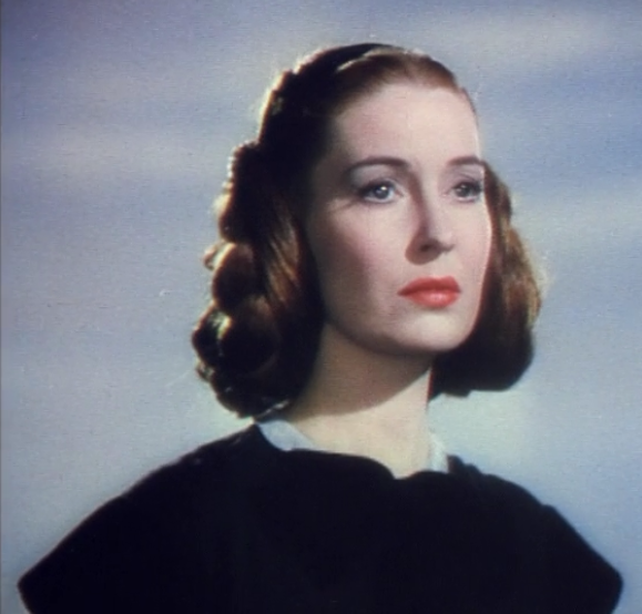
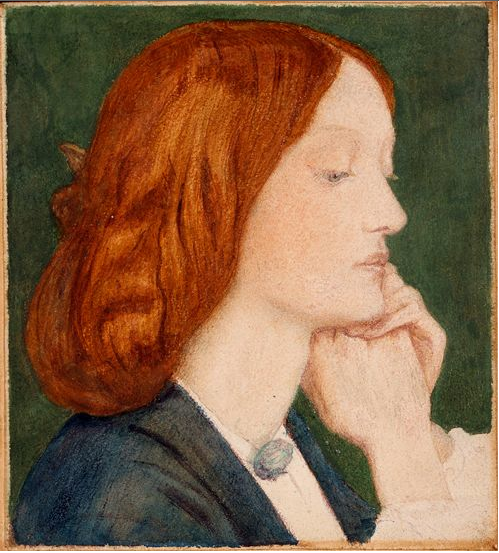
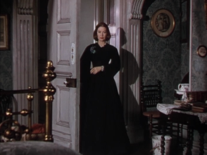
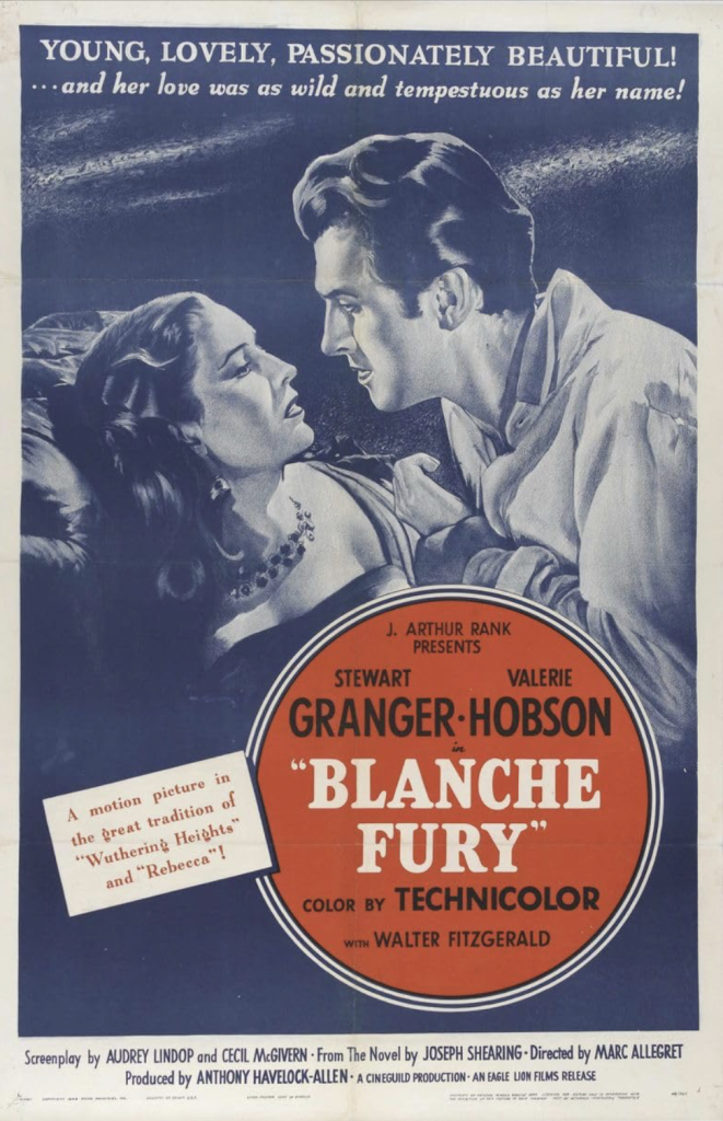
But when watching Blanche Fury (1948), “Pre-Raphaelite” leapt to mind for a completely different reason. Instead of an abundance of loose curls, Blanche’s pinned hair falls in soft, heavy sections reminiscent of Elizabeth Siddal.
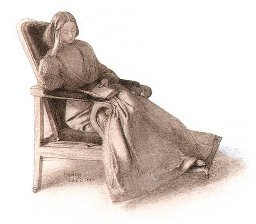
Valerie Hobson as Blanche FuryPainting of Elizabeth Siddal by Dante Gabriel Rossetti, 1854
It’s that particular Siddal quality, as if the pins in her hair are only suggestions.
Georgiana Burne-Jones once described Siddal’s hair as “very loosely fastened up, so that it fell in soft, heavy wings.” And that is exactly the phrase that kept whispering through my mind as I watched Blanche Fury. Blanche’s hair forms similar wings, giving the impression of weight and softness.
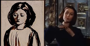
Sketch of Elizabeth Siddal by Dante Gabriel Rossetti on the left, Valerie Hobson as Blanche Fury on the right.Blanche FuryDrawing of Elizabeth Siddal reading by Dante Gabriel Rossetti, 1854
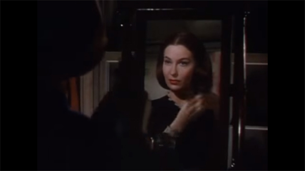
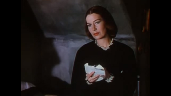
As for the film itself, this melodramatic gothic tale has plenty of atmosphere, but loses its grip too quickly, like a story that sets up a storm but forgot the lightning it’s been promising.
Interestingly, the people closest to it seemed to feel something similar.
Producer Anthony Havelock-Allen later admitted the film took too long, cost too much, and didn’t connect with audiences the way they’d hoped. He described it as a “hard” film with too much real hatred mixed in with the romance, and not enough of the lush escapism the public wanted at the time.
Actress Valerie Hobson, who was married to Havelock-Allen at the time (and later married the scandalous MP John Profumo) spoke about the film with tenderness. She’d just had their son, who was born with Down’s Syndrome, and she said the film was meant as a “loving gift,” a way to restore her to leading lady status, although she ultimately felt the film didn’t fully work.
And yet: I keep thinking the plot does have strong bones.
Which is why, despite my frequent grumbling about Hollywood’s remake machine, I can’t help imagining a retelling that actually leans into what Blanche Fury only half grasps.
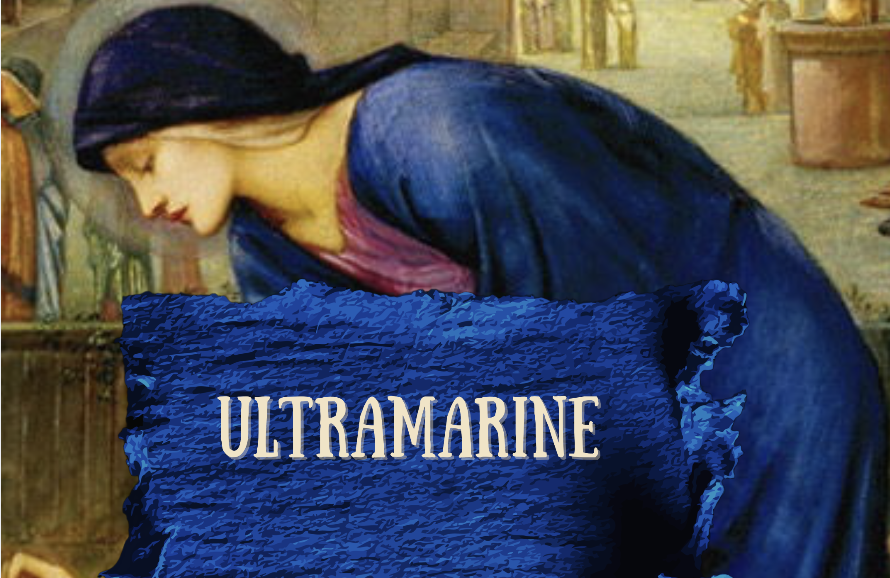
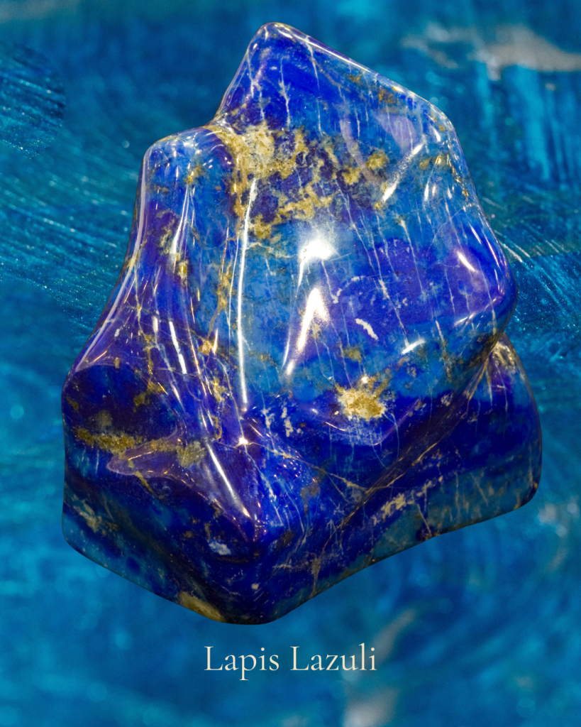
For centuries, the most luminous ultramarine came from lapis lazuli mined in remote mountains (and moved across continents by hand, animal, ship, and at great risk).
Before it ever touched a brush, it had already lived several lives: as stone, as treasure, as trade, as an ordeal. By the time the pigment reached a painter’s studio, it arrived with a built in mythology of rarity and great value.
Where it comes from and why it mattered
Natural ultramarine is made by grinding lapis lazuli and laboriously separating the blue particles from duller minerals. It was hard work and low yield, meaning you could throw a lot of money at it and still not get much.
That scarcity became part of its aura. It was limited, temperamental, and priced like a jewel.
The business of a sacred blue
In many workshops, ultramarine was treated like a luxury ingredient. Patrons sometimes specified it in contracts, especially when they wanted a painting to announce devotion and status in the same breath.
A painter would often make decisions like:
Use ultramarine only where it counts
Substitute cheaper blues elsewhere
Reserve it for the most symbolically loaded surfaces
In other words: color as strategy.
The symbolism
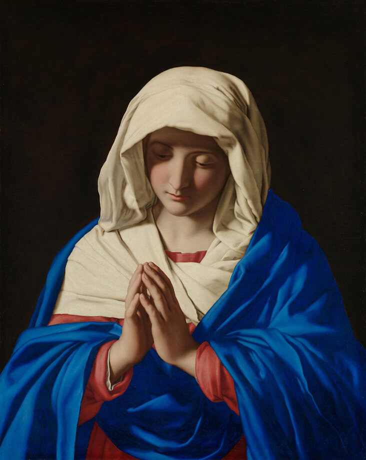
Ultramarine’s cultural meaning didn’t come only from religion, but religion supercharged it. In Western European painting, it became linked to the sacred, especially through Marian blue*.
The Virgin with Angels (La Vierge aux anges), also known as The Song of the Angels, 1881, by artist William-Adolphe BouguereauThe Virgin in Prayer, Giovanni Battista Salva da Sassoferrato 1650
Ultramarine evokes emotion
It’s a hue that carries the hush and mystery of distance: deep ocean, a starry night, or the far side of a mountain range. Because it’s so saturated, it doesn’t just sit on the surface; it seems to gather light and hold it.
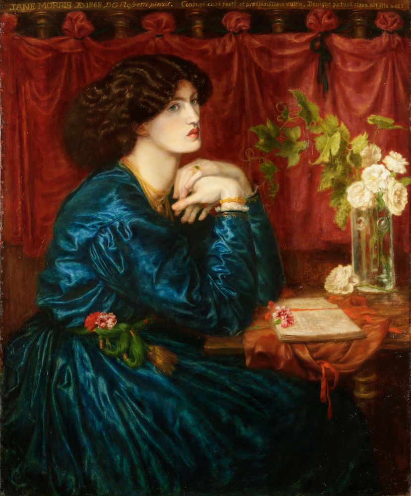
The Blue Silk Dress, Dante Gabriel Rossetti (model Jane Morris)
The beauty of ultramarine is that it refuses to be merely decorative. It has depth without gloom, richness without shouting. It can read as sky, sea, velvet, or benediction, sometimes all at once, holding both distance and devotion in the same breath. Even now, when the pigment is no longer rare, the color still behaves like something precious: it gathers our attention, steadies our gaze, and makes a little room in the mind for wonder.
Ultramarine doesn’t just color a surface; it dignifies it, quietly.
*More on Marian Blue on this Wikipedia page, along with links to a variety of shades, complete with swatches.
Somewhere along the way, we learned a suspicious equation:
beauty = avoidance joy = ignorance aesthetic pleasure = moral failure
Art history disagrees.
The creation of art has rarely been a lounge chair on a sunny terrace. More often, it’s been a hand pressed to the wall in a burning building, testing for heat, searching for the exit, steadying the trembling. People have turned to images in plague years, war years, famine years, and exile years. Not because they were indifferent, but because the human psyche cannot metabolize catastrophe in a single sitting.
We do not live on truth alone. We live on truth with a pulse.
Beauty, then, isn’t a sugar coating.
It’s a nutrient.
It’s one of the ways we remain human while the world tries, daily, to render us numb.
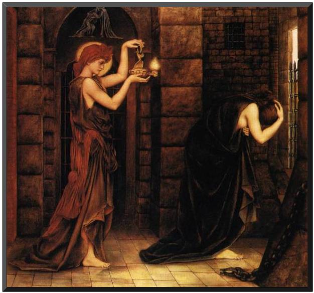
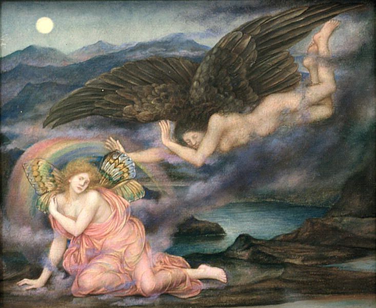
Hope in the Prison of Despair, Evelyn De Morgan
Beauty as companionship, not denial
Behold: the modern feed, a corridor of sirens and screams. The news arrives like a tumultuous weather system. Uninvited, invasive, changing the pressure in the room. Many of us are walking around with a body that thinks it’s still in emergency mode: shoulders near the ears, jaw locked like a stubborn gate, breath held as if air must be rationed.
And then someone posts a painting. A small still life. A luminous face. A forest green drapery, a gold-edged sleeve. The comments split into two camps: How can you post this now? versus Thank you, I needed this.
I’m realizing that this is where Guggums lives: in the tender seam between those reactions. Not to arbitrate who is correct, but to ask a more useful question:
What if beauty isn’t a detour from reality, but a way to stay with it?
What if art, at its best, is not denial? Perhaps it is companionship.
Community care isn’t always a grand sweeping movement. Sometimes it’s a “quiet room.”
When people say “community care,” we often imagine action: fundraising, organizing, showing up, building the infrastructure of survival. Yes. Absolutely. No argument from me; bring the banners, bring the water, bring the phone chargers.
But community care also includes something subtler: regulation.
A community of dysregulated nervous systems cannot sustain long-term work. If your body is constantly braced for impact, even your compassion will start to feel like a task you’re failing.
This is why we should make space for art.
Not art that says, “Everything is fine.” Art that says, “You are here. I am here. Breathe with me.”
Companionship, not denial.
What the painters knew: the eye can be a lifeline
Let us wander back through a few centuries, as one does.
The medieval icon: a stare that holds you steady
Medieval icon of St. George
Icons aren’t “pretty.” They are present. Their gold grounds do not mimic the world; they insist that another kind of reality is available, one where your suffering is seen without spectacle. The gaze is frontal, unwavering. Not entertainment. Not escape.
A companion.
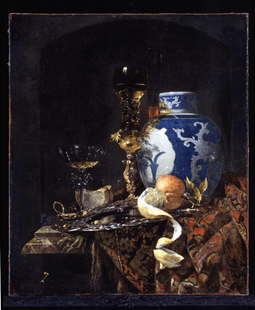
Willem Kalf, Still-Life with a Late Ming Ginger Jar, circa 1650
The Dutch still life: attention as resistance
A lemon peel spirals. A wineglass catches light. The tablecloth wrinkles like a small landscape. In eras shadowed by death (and yes, the Dutch knew plague and war intimately), still lifes were not naive. They were meditations on time, fragility, and the holiness of the ordinary.
Sometimes the most radical thing you can do is look slowly.
The Day Dream, Dante Gabriel Rossetti
The Pre-Raphaelite dream: beauty with a bruise
Those lush greens and medieval reveries? They weren’t just aesthetic indulgence. They were a protest against industrial brutality, against a world flattening into soot and speed. Their beauty wasn’t complacent; it was insistent.
Art doesn’t always solve. It often stays.
The Black Brunswicker, Sir John Everett Millais
The difference between tone deaf and tender
So how do we share beauty without sounding like we’re handing someone a lavender-scented bandage for a broken bone?
Here’s the difference, distilled:
Tone deaf beauty says: “Look at this and stop feeling bad.” Tender beauty says:“Look at this while you feel what you feel.”
Tone deaf beauty insists on a pivot. Tender beauty offers a parallel lane.
Tone deaf beauty performs positivity. Tender beauty practices presence.
Tone deaf beauty centers the poster’s comfort (“let’s keep it light!”). Tender beauty centers the audience’s reality (“this is heavy; you’re not alone”).
If you want a rule you can carry in your pocket like a coin:
Do not use beauty to erase pain. Use beauty to accompany people who are in pain.
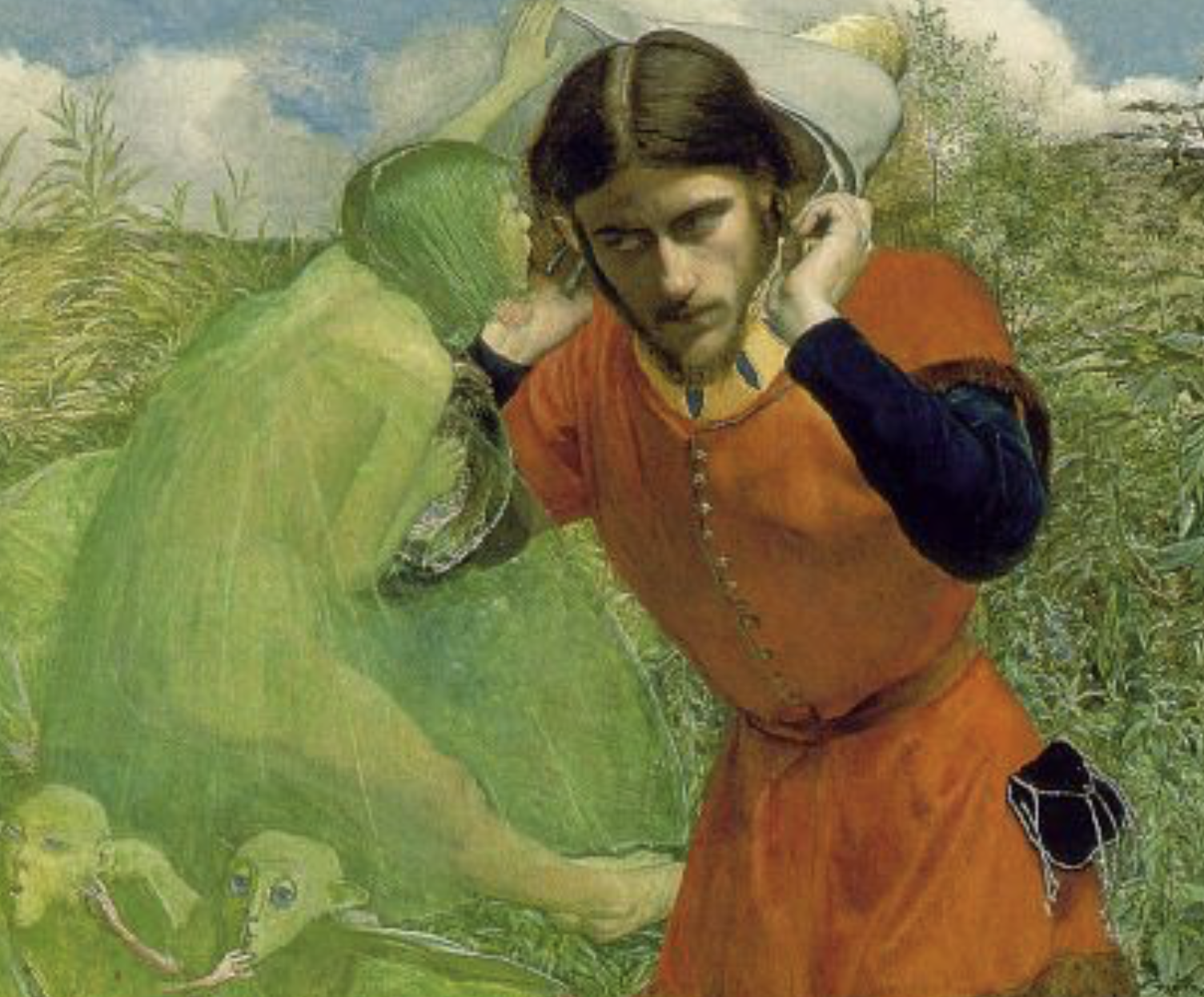
This is where The Tempest slips off the page. Pre-Raphaelite attention pins unseen magic to a real patch of grass and leaf, until the atmosphere around him feels nearly touchable.
A quick Tempest refresher (no homework required)
Millais is painting an episode from The Tempest, Act I, Scene II: Ferdinand, shipwrecked on Prospero’s enchanted island, hears music and tries to locate it “i’ the air or the earth?” as Ariel sings “Full fathom five thy father lies.”
This is the moment where the island begins to do what it does best: guide you without asking permission.
Ferdinand Lured by Ariel by Sir John Everett Millais
What’s happening in the painting
Ferdinand is foregrounded and intensely physical, wearing a red tunic, white hose, with one foot edging forward; yet his face is turned inward, listening. Ariel is there, but not there: a green, surreal presence tipping Ferdinand’s hat, close enough to touch him, impossible to truly see.
And then there are the wonderfully odd little creatures, green “bats” posed in a way that echoes “see no evil, hear no evil, speak no evil,” a detail that reportedly unsettled at least one early would-be buyer because it wasn’t the sweet, dainty fairy world people expected.
Millais isn’t offering a Victorian stage fairy. He’s giving you something stranger: nature itself behaving like theatre.
Why this painting matters in Pre-Raphaelite terms
This work is often pointed to as Millais’ first big attempt at the early PRB “paint what you actually see” intensity, done outdoors (plein air) at Shotover Park near Oxford.
That shows in the greenery. The plants aren’t “background.” They are presence: each clump, blade, and leaf treated as if it has rights. (This is the Pre-Raphaelite promise: the world is not a blur behind the story; the world is part of the story.)
There’s also the PRB brightness. Millais painting with heightened, saturated color, including working on a white ground to keep the whole surface lit from beneath. The red tunic against that ferocious green is basically a visual bell: you can almost hear it.
The genius choice: making the invisible visible (without ruining it)
How do you paint a spirit like Ariel, without making them into a literal cartoon fairy?
Millais’ solution is sly: he lets Ariel half disappear into the green, more like camouflage than costume. Ferdinand looks right at him, and still can’t see him. We, the viewers, can (sort of.)
It’s a perfect visual equivalent of the scene: Ferdinand is being led by something he can’t name. The island doesn’t announce itself. It insinuates.
A few things to notice when you look
The hands at Ferdinand’s ears: he’s not just hearing, he’s straining, trying to catch meaning.
That hat string detail: such a small, domestic tether in a supernatural moment, and it makes the enchantment feel practical.
The arched/circular framing: it reads like a portal, a vignette, a “peep into another world” shape. Very fairy tale, but also very controlled.
The greens: not one green, but many: acid, moss, olive, yellow green, stacked until “nature” becomes almost hallucinatory.
A tiny afterlife note (because art has one)
The finished painting was exhibited at the Royal Academy in 1850, and it has lived largely in private collections; it even became the subject of a UK temporary export bar in 2019, a reminder that these early PRB works are still treated as cultural treasures with real stakes attached.
Why I keep coming back to it
Because it’s not just “Shakespeare, illustrated.”
It’s Shakespeare filtered through that Pre-Raphaelite conviction that the world is charged, that grass and shadow can be as dramatic as a human face; that beauty can be exacting, almost severe; that the supernatural doesn’t have to glitter to be real.
Millais shows us a man lured by a musical spell.
And if you’ve ever felt art do that to you, pull you forward by the collar with something you can’t quite explain, then you already know this painting’s secret.