
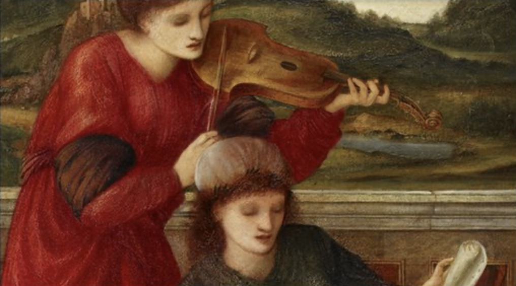
See the standing figure in crimson? She feels like a held note to me; still and focused. While the seated figure reads the sheet music as if her thoughts are blending with each note. Behind them, the landscape recedes into that dreamy, Italianate distance Burne-Jones loved: not quite a real place, more like a mind’s “elsewhere,” where art and feeling get to linger.
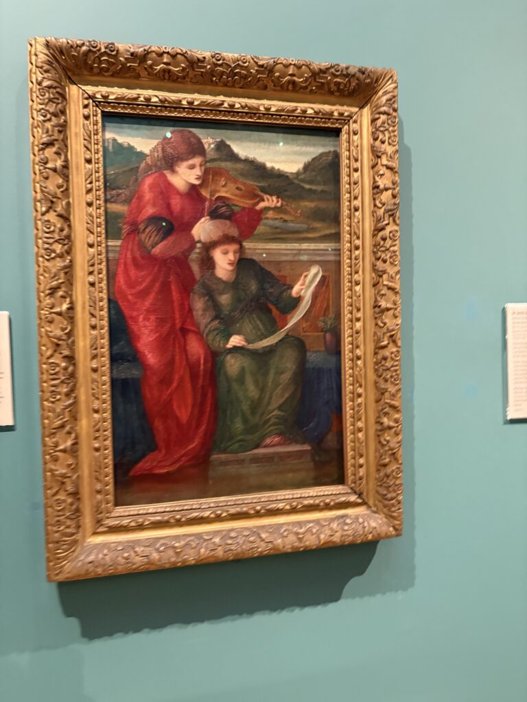
This painting lives at the Ashmolean Museum in Oxford (oil on canvas), and it has that distinct Burne-Jones hush: beauty that isn’t trying to dazzle, just to enchant, slowly, the way a melody does when you finally stop hurrying.
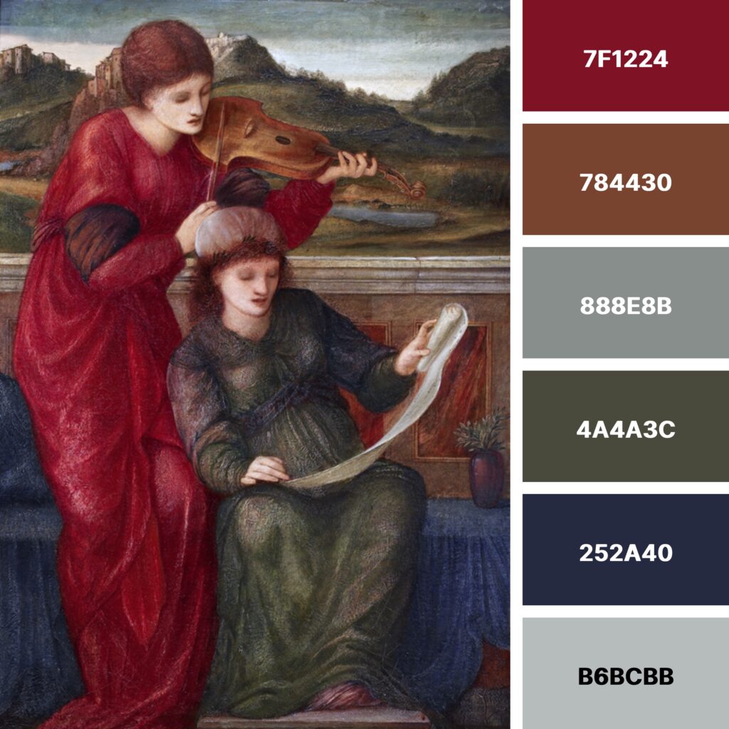
I’ve created a color palette based on Music, feel free to use it if it resonates with you.
HEX codes didn’t exist in the Pre-Raphaelites’ era, of course, but translating their hues into a digital palette is a strangely satisfying way to carry their colors into the modern world.
This palette feels like music wrapped in velvet. It’s rich, hushed, and quietly dramatic.
The garnet red(7F1224) is the painting’s heartbeat (that sweeping dress), grounded by warm, woody brown (784430) like the violin’s body and carved stone details. Around them, Burne-Jones cools everything down with misty greys (888E8B, B6BCBB) in the sky, marble, and distant light, then deepens the mood with mossy olive (4A4A3C) and midnight indigo (252A40), the shadow notes that make the whole scene feel intimate, contemplative, and Renaissance dreamlike.
As an example of how to use HEX codes, I used HTML to make the background of this text that delicious crimson we see in 7F1224, while the text uses the misty grey B6BCBB code.
For more beauty, color, and curiosity, subscribe to the Guggums newsletter