Category: Art Appreciation

  • When Critics Confuse Personal Taste With Cultural Judgment

    When Critics Confuse Personal Taste With Cultural Judgment

    In a recent interview, actor Timothée Chalamet stirred up controversy by saying ‘no one cares’ about ballet and opera anymore, and defenders of both art forms took to social media to set the record straight. Many argued that just because something isn’t to someone’s taste doesn’t mean it’s lost its value. Alex Beard, who runs The Royal Ballet and Opera, said ticket sales have actually increased thanks to the attention. It’s funny how one offhand remark can spark a conversation about what matters in culture and how easily personal opinion is mistaken for universal truth.

    Here’s The Royal Ballet and Opera’s Instagram response to Chalamet’s comments:

    When people say no one cares, they often just mean that they don’t care, or that their friends don’t care. That’s not the same thing.

    This pattern is longstanding.

    Admirers of Pre-Raphaelite art know this script by heart.

    The Day Dream, Dante Gabriel Rossetti
    The Day Dream, Dante Gabriel Rossetti

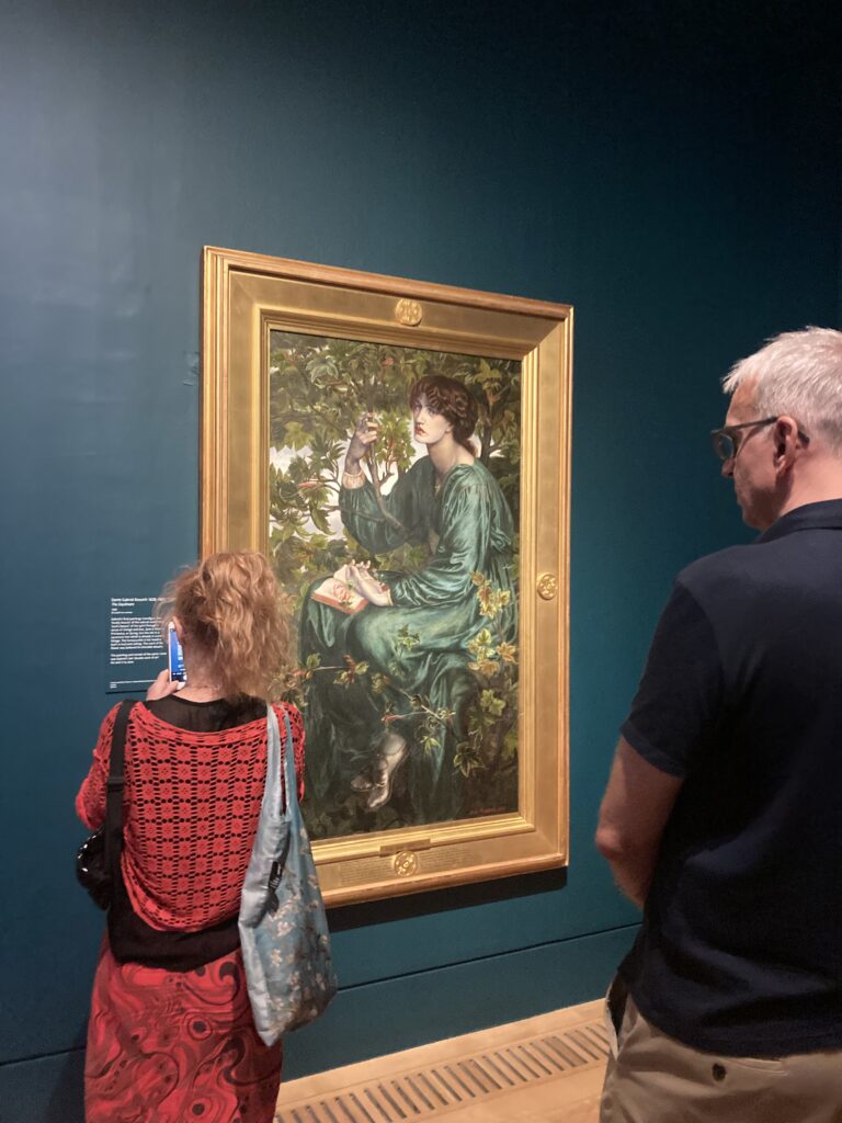
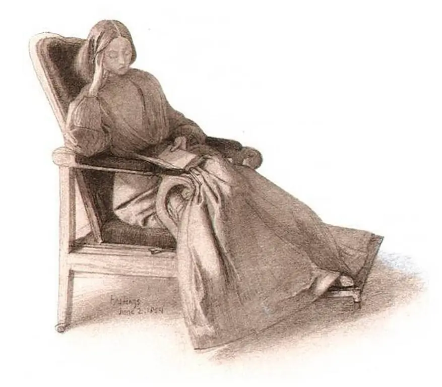
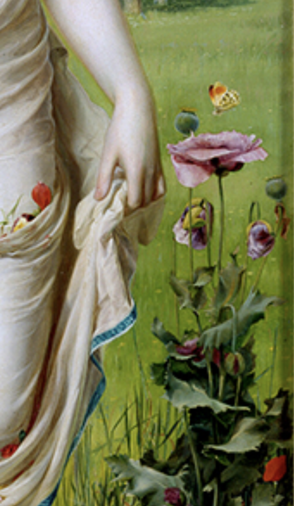
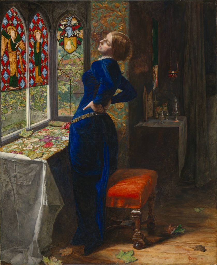
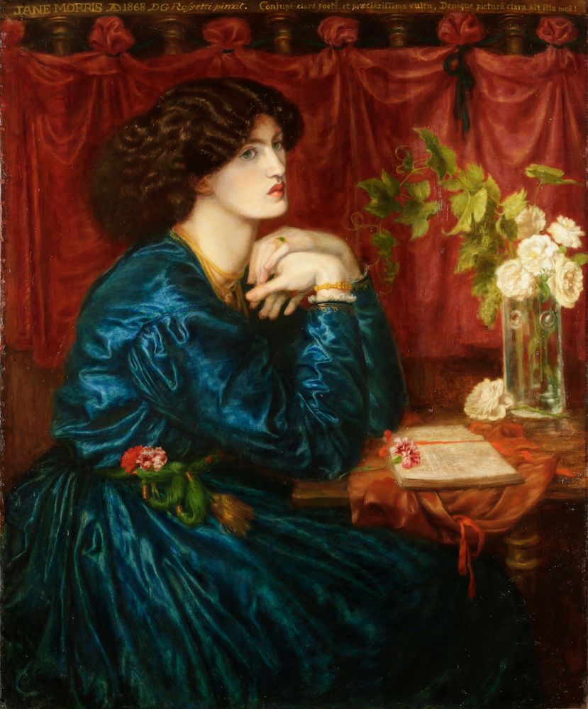
    Founded in 1848, the Pre-Raphaelite movement challenged stale academic routines. The Brotherhood sought sharper observation, richer symbolism, and more focus on beauty, nature, and emotion. It was never just decorative. It was meant to matter.

    In the twentieth century, the Pre-Raphaelites were often criticized as excessive, sentimental, or embarrassingly lush. ‘Overly sentimental’ was a common rebuke, but the real issue often lay in the open expression of strong emotion.

    Importantly, this issue is not confined to Victorian England or the mid-twentieth century. Even today, some critics continue to dismiss Pre-Raphaelite art.

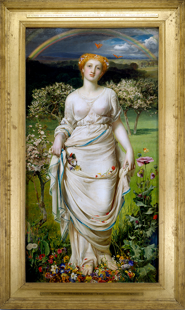
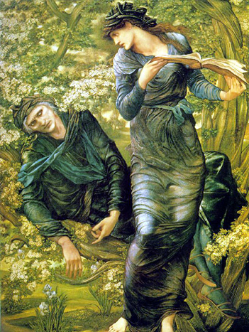
    Jonathan Jones observed that ‘a lot of critics disdain this period,’ and in his review of the Burne-Jones exhibition at Tate Britain several years ago, he described it as ‘how boring beauty can be’ and declared Burne-Jones to be ‘a stupid artist.’ 

    the beguiling of merlin
    The Beguiling of Merlin, Sir Edward Burne-Jones

    These attitudes may seem discerning, but are often habitual. Beauty is dismissed as superficial, narrative as naive, and emotion as weakness. Critics can appear more unsettled by art that evokes strong responses than by art that fails to engage.

    Here, Chalamet’s episode and the Pre-Raphaelite story meet. Both show how personal dislike is confused with cultural judgment, and how authority figures shape what is deemed significant.

    A recurring pattern of scorn

    Ballet and opera are called elitist or dull. Pre-Raphaelite art is labeled sentimental, decorative, or excessive. The terms change, but critics persistently dismiss them, then act surprised or scornful when the public remains interested.

    Nevertheless, audiences continue to attend these performances and exhibitions.

    This persistence is key. However labeled by critics, audiences engage. This is not naivety. Audiences see what critics overlook: beauty, atmosphere, emotion, and art that invite appreciation.

    Madama Butterfly

    Of course, this does not mean all criticism is wrong.

    Acknowledging that critics can be dismissive does not suggest that critique itself is unnecessary.

    Some Pre-Raphaelite works are uneven or excessive. Some raise questions about gender, idealization, medievalism, empire, and the politics of beauty. Those questions matter; serious criticism helps us see and understand more.

    However, it is important to distinguish between critique and contempt.

    Critique involves careful and thoughtful examination. Contempt feels performative and superficial.

    Personal dislike does not constitute cultural judgment.

    It’s easy to conflate personal dislikes with genuine judgment. Historically, critics have often proclaimed the demise of art forms they did not favor, confusing personal opinion with cultural fact.

    Yet these art forms persist.

    They live on because they are vital. 

    Art endures through those who passionately engage it. Its vitality comes from devoted audiences: proof that meaning and value are not bestowed by critics, but earned by ongoing, genuine appreciation.

    Elizabeth Siddal
  • Frederick Sandys’ Gentle Spring and the depiction of renewal

    Frederick Sandys’ Gentle Spring and the depiction of renewal

    We seem to imagine spring as soft and feminine by default: mild weather, pastel colors, and a dreamy sense of renewal. Decorative rather than forceful.

    In his painting Gentle Spring, Victorian artist Frederick Sandys leans into that visual language, yet he gives it more gravity. His central figure represents Proserpina (Persephone) returning from the underworld, and knowing the subject gives the image a sense of shadow. 

    She doesn’t skip or scatter petals with cheerful abandon. She advances with composure, less a girl in a garden than an embodiment of return.

    That distinction matters.

    Because Gentle Spring belongs to a long nineteenth-century habit of making women carry ideas larger than themselves: spring, virtue, beauty, grief, nations, seasons, salvation, doom.

    Femininity in art is often asked to symbolize life rather than simply live it.

    sandys gentle spring
    Gentle Spring, Frederick Sandys

    There is restraint in her posture and a seriousness in her facial expression. And a sense that spring is not arriving untouched but returning from difficulty, which is spot on for a representation of Proserpina. That symbolism leaves room for the realization that renewal is rarely as innocent as it often looks in paintings.

    That is part of what makes the beginning of spring such a charged subject.

    We celebrate it, but we also project onto it.

    As if we ask it to heal the whole year in a single gesture.

    Gentle Spring detail

    And there is a cultural question to ponder: when a woman becomes the image of spring, who is being renewed? Her, or the viewer?

    Beauty is never just beauty; it is arrangement, emphasis, and framing. Who is seen, how they are framed, what they are asked to mean, and none of that is neutral. Victorian artists knew this perfectly well, even when they dressed the fact in flowers.

    (Especially when they dressed the fact in flowers.)

    Yet I do not think Gentle Spring collapses into cynicism. The painting still has real emotional resonance, and its pleasures do not ring false because they are constructed.

    All art is constructed.

    The point is to notice what the construction is doing.

    What this one does, especially at the beginning of spring, is offer renewal without pretending renewal is simple. The rainbow arches, but the dark sky still holds its clouds. The landscape blooms, but within the new growth and bright colors there is still the promise of turbulent weather.

    That feels true to the season.

    Spring is not a Technicolor pastel reset. It is the world resuming itself, unevenly and in earnest. It is beauty and blooms, as well as thorns and storms.

    And perhaps that is why Gentle Spring remains worth returning to: not because it gives us a flawless emblem of the season, but because it reminds us that beginnings can be lovely without being naive. And I find something very human in that.

  • Ultramarine isn’t just blue. It’s blue with a pedigree.

    Ultramarine isn’t just blue. It’s blue with a pedigree.

    Mariana, Sir John Everett Millais
    Mariana, Sir John Everett Millais

    For centuries, the most luminous ultramarine came from lapis lazuli mined in remote mountains (and moved across continents by hand, animal, ship, and at great risk).

    Before it ever touched a brush, it had already lived several lives: as stone, as treasure, as trade, as an ordeal. By the time the pigment reached a painter’s studio, it arrived with a built in mythology of rarity and great value.

    Where it comes from and why it mattered

    Natural ultramarine is made by grinding lapis lazuli and laboriously separating the blue particles from duller minerals. It was hard work and low yield, meaning you could throw a lot of money at it and still not get much.

    That scarcity became part of its aura. It was limited, temperamental, and priced like a jewel.

    The business of a sacred blue

    In many workshops, ultramarine was treated like a luxury ingredient. Patrons sometimes specified it in contracts, especially when they wanted a painting to announce devotion and status in the same breath.

    A painter would often make decisions like:

    • Use ultramarine only where it counts
    • Substitute cheaper blues elsewhere
    • Reserve it for the most symbolically loaded surfaces

    In other words: color as strategy.

    The symbolism

    Ultramarine’s cultural meaning didn’t come only from religion, but religion supercharged it. In Western European painting, it became linked to the sacred, especially through Marian blue*.

    The Virgin with Angels (La Vierge aux anges), also known as The Song of the Angels, 1881, by artist William-Adolphe Bouguereau
    The Virgin in Prayer, Giovanni Battista Salva da Sassoferrato 1650

    Ultramarine evokes emotion

    It’s a hue that carries the hush and mystery of distance: deep ocean, a starry night, or the far side of a mountain range. Because it’s so saturated, it doesn’t just sit on the surface; it seems to gather light and hold it.

    The Blue Silk Dress, Dante Gabriel Rossetti (model Jane Morris)

    The beauty of ultramarine is that it refuses to be merely decorative. It has depth without gloom, richness without shouting. It can read as sky, sea, velvet, or benediction, sometimes all at once, holding both distance and devotion in the same breath. Even now, when the pigment is no longer rare, the color still behaves like something precious: it gathers our attention, steadies our gaze, and makes a little room in the mind for wonder.

    Ultramarine doesn’t just color a surface; it dignifies it, quietly.

    *More on Marian Blue on this Wikipedia page, along with links to a variety of shades, complete with swatches.

  • Color Harmonies, Explained (With Rossetti as Our Mischievous Guide)

    Color Harmonies, Explained (With Rossetti as Our Mischievous Guide)

    Color harmony sounds like a polite term, as if it should wear a waistcoat and speak softly in a museum.

    But in practice, it’s closer to a well orchestrated conspiracy: colors making private agreements in the corner of a painting, deciding who gets to glow, who must recede, and who will quietly ruin the mood.

    To keep it simple: color harmony is the way colors relate to each other so the image feels unified, even when the scene is tense, eerie, or emotionally unsteady.

    Today we’ll use two Rossetti paintings as our case studies:

    • The First Madness of Ophelia a bright, jewel toned stage where color plays court politics.
    • How They Met Themselves  a dark forest where color whispers, doubles back, and does something unsettling behind your shoulder.

    The Four Harmonies You’ll Actually Use

    Analogous harmony (neighbors on the color wheel)

    Colors that sit beside each other: like green/blue/teal, or red/orange/gold.
    Effect: calm, cohesive, “all from the same world.”

    Complementary harmony (opposites)

    Colors across the wheel: like red/green or blue/orange.
    Effect: drama, vibration, attention. It’s the visual equivalent of someone saying, Excuse me? in a drawing room.

    Triadic harmony (three evenly spaced colors)

    Think red, blue, yellow (or versions of them).
    Effect: lively balance, storybook clarity, controlled energy.

    Tonal harmony (one family, many values)

    A limited palette with shifts in light/dark rather than hue.
    Effect: atmosphere, unity, mood, like fog in paint form.

    The First Madness of Ophelia: Harmony as Social Theater

    In The First Madness of Ophelia, Rossetti gives you a scene that feels decorative on first glance (gold, blue, red, green) until you notice how carefully the colors are arranged, like people placed at a dinner table to cause maximum tension without anyone “making a scene.”

    madness of ophelia
    The First Madness of Ophelia; Dante Gabriel Rossetti

    What you’re seeing, harmonically

    A blend of complementary and triadic harmony:

    • Blue (Ophelia’s dress) acts as the emotional anchor; cool, steady, and a bit removed.
    • Gold/orange (the background) presses forward, warming and enclosing her. It’s rich, theatrical, almost airless.
    • Red accents (in clothing and details) spike the whole arrangement with urgency.
    • Greens (notably in surrounding garments) act as a mediator. Earthy, tempering, but also quietly ominous.

    Why it works

    Rossetti is balancing hot vs. cool and stillness vs. flare:

    • Blue vs. gold is a classic complement (cool/warm opposition).
    • The red notes keep your eye moving like gossip traveling across a room.
    • The gold ground unifies everything, like varnish on a secret.


    This painting is what happens when Blue tries to remain composed at a party, Gold keeps leaning too close, and Red keeps interrupting with scandalous remarks. Meanwhile Green stands by the wall pretending to be helpful while taking notes.

    Takeaway you can use

    If you want a composition to feel coherent but tense, try this:

    • Choose one dominant color (Ophelia blue)
    • Surround it with its warm opposite (gold/orange)
    • Add tiny red “alarms” to direct attention

    How They Met Themselves: Harmony as a Trap

    This Rossetti painting is a very different creature: a forest scene, dim and enclosed, where figures double and the atmosphere feels like it’s holding its breath.

    Dgr Metthemselves
    How They Met Themselves, Dante Gabriel Rossetti (1864) Two lovers walk through a forest and encounter their own doppelgangers.

    What you’re seeing, harmonically

    Tonal harmony with a controlled red/green complement:

    • The whole painting lives in a restricted world of deep greens, browns, and black.
    • That limitation creates tonal unity, everything belongs to the same air, the same hour, the same moral weather.
    • Then Rossetti introduces red in small but strategic places (trim, details), and suddenly the image has a pulse.

    Why it works

    When you limit hue, value (light/dark) and temperature become the drama:

    • The forest is a single harmonic “key”, like a piece of music that refuses to modulate.
    • The figures feel caught inside it, because the palette doesn’t offer an escape route.
    • Red becomes the signal flare: not enough to brighten, just enough to warn.

    Perhaps this forest is not merely a forest. It is a well trained predator wearing green. The reds are its teeth, kept politely out of sight until you’re close enough to notice.

    Takeaway you can use

    If you want mood (and mild dread) in your own palette:

    • Keep most colors in one family (greens/browns)
    • Push contrast using light/dark values
    • Add a small complementary accent (a controlled red) to make the image feel “alive”

    A Simple Way to Spot Harmony in Any Painting

    1. What color dominates? (the “boss”)
    2. What color opposes it? (the “argument”)
    3. What color connects everything? (the “glue”, often golds, browns, grays, or repeated neutrals)

    In Ophelia, the glue is that golden atmosphere.
    In How They Met Themselves, the glue is the dark green/brown tonal world.

    Try This: Two Quick Color-Harmony Exercises

    Exercise A (Ophelia style)

    Pick:

    • 1 dominant cool (blue)
    • 1 enclosing warm (gold/orange)
    • 1 small alarm accent (red)

    Use it in a mood board, a room palette, a graphic… anything. Keep red small.

    Exercise B (Forest style)

    Pick:

    • 3 related darks (greens/browns/near-black)
    • 1 tiny opposite accent (red)

    Make the mood work by shifting light/dark, not adding more colors.

    Rossetti understood that harmony isn’t the same as happiness. Sometimes harmony is how a painting locks a feeling in place, beauty arranged so perfectly it becomes a kind of spell.

    And if you’re thinking, That’s dramatic for a color wheel, well… that’s exactly the point.