Color harmony sounds like a polite term, as if it should wear a waistcoat and speak softly in a museum.
But in practice, it’s closer to a well orchestrated conspiracy: colors making private agreements in the corner of a painting, deciding who gets to glow, who must recede, and who will quietly ruin the mood.
To keep it simple: color harmony is the way colors relate to each other so the image feels unified, even when the scene is tense, eerie, or emotionally unsteady.
Today we’ll use two Rossetti paintings as our case studies:
- The First Madness of Ophelia a bright, jewel toned stage where color plays court politics.
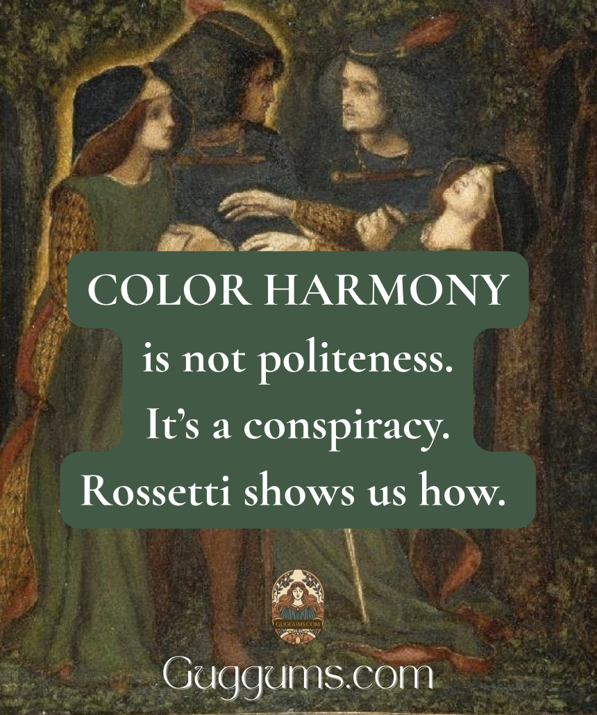
- How They Met Themselves a dark forest where color whispers, doubles back, and does something unsettling behind your shoulder.
The Four Harmonies You’ll Actually Use
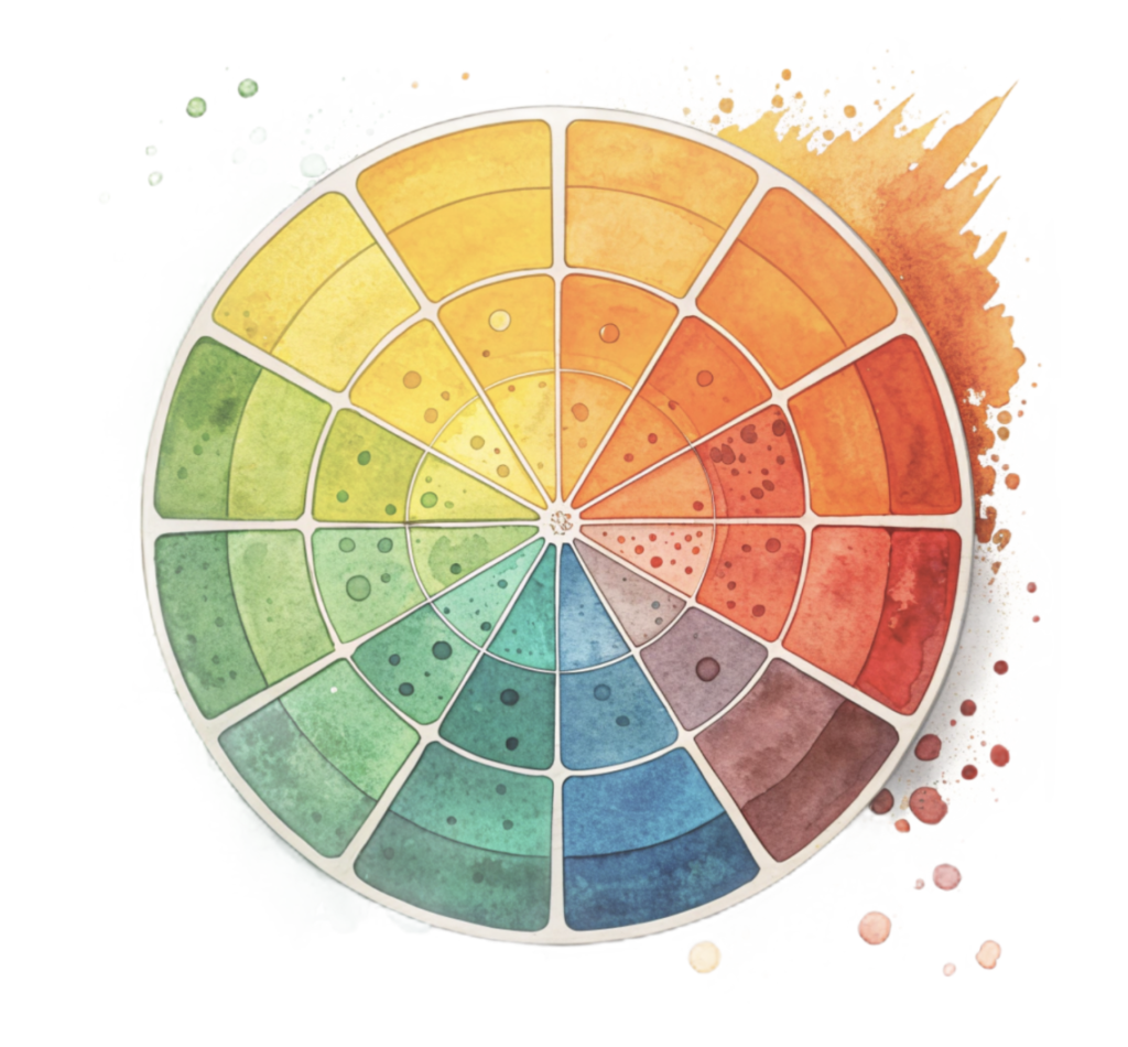
Analogous harmony (neighbors on the color wheel)
Colors that sit beside each other: like green/blue/teal, or red/orange/gold.
Effect: calm, cohesive, “all from the same world.”
Complementary harmony (opposites)
Colors across the wheel: like red/green or blue/orange.
Effect: drama, vibration, attention. It’s the visual equivalent of someone saying, Excuse me? in a drawing room.
Triadic harmony (three evenly spaced colors)
Think red, blue, yellow (or versions of them).
Effect: lively balance, storybook clarity, controlled energy.
Tonal harmony (one family, many values)
A limited palette with shifts in light/dark rather than hue.
Effect: atmosphere, unity, mood, like fog in paint form.
The First Madness of Ophelia: Harmony as Social Theater
In The First Madness of Ophelia, Rossetti gives you a scene that feels decorative on first glance (gold, blue, red, green) until you notice how carefully the colors are arranged, like people placed at a dinner table to cause maximum tension without anyone “making a scene.”
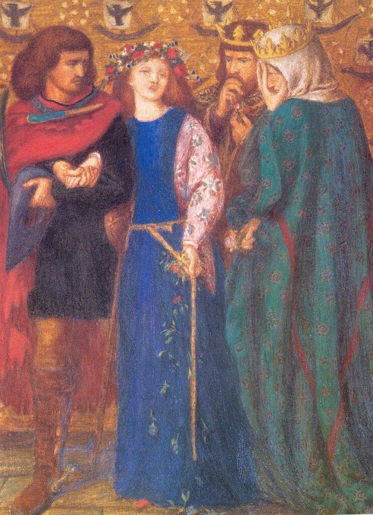
What you’re seeing, harmonically
A blend of complementary and triadic harmony:
- Blue (Ophelia’s dress) acts as the emotional anchor; cool, steady, and a bit removed.
- Gold/orange (the background) presses forward, warming and enclosing her. It’s rich, theatrical, almost airless.
- Red accents (in clothing and details) spike the whole arrangement with urgency.
- Greens (notably in surrounding garments) act as a mediator. Earthy, tempering, but also quietly ominous.
Why it works
Rossetti is balancing hot vs. cool and stillness vs. flare:
- Blue vs. gold is a classic complement (cool/warm opposition).
- The red notes keep your eye moving like gossip traveling across a room.
- The gold ground unifies everything, like varnish on a secret.
This painting is what happens when Blue tries to remain composed at a party, Gold keeps leaning too close, and Red keeps interrupting with scandalous remarks. Meanwhile Green stands by the wall pretending to be helpful while taking notes.
Takeaway you can use
If you want a composition to feel coherent but tense, try this:
- Choose one dominant color (Ophelia blue)
- Surround it with its warm opposite (gold/orange)
- Add tiny red “alarms” to direct attention
How They Met Themselves: Harmony as a Trap
This Rossetti painting is a very different creature: a forest scene, dim and enclosed, where figures double and the atmosphere feels like it’s holding its breath.

What you’re seeing, harmonically
Tonal harmony with a controlled red/green complement:
- The whole painting lives in a restricted world of deep greens, browns, and black.
- That limitation creates tonal unity, everything belongs to the same air, the same hour, the same moral weather.
- Then Rossetti introduces red in small but strategic places (trim, details), and suddenly the image has a pulse.
Why it works
When you limit hue, value (light/dark) and temperature become the drama:
- The forest is a single harmonic “key”, like a piece of music that refuses to modulate.
- The figures feel caught inside it, because the palette doesn’t offer an escape route.
- Red becomes the signal flare: not enough to brighten, just enough to warn.
Perhaps this forest is not merely a forest. It is a well trained predator wearing green. The reds are its teeth, kept politely out of sight until you’re close enough to notice.

Takeaway you can use
If you want mood (and mild dread) in your own palette:
- Keep most colors in one family (greens/browns)
- Push contrast using light/dark values
- Add a small complementary accent (a controlled red) to make the image feel “alive”
A Simple Way to Spot Harmony in Any Painting
- What color dominates? (the “boss”)
- What color opposes it? (the “argument”)
- What color connects everything? (the “glue”, often golds, browns, grays, or repeated neutrals)
In Ophelia, the glue is that golden atmosphere.
In How They Met Themselves, the glue is the dark green/brown tonal world.
Try This: Two Quick Color-Harmony Exercises
Exercise A (Ophelia style)
Pick:
- 1 dominant cool (blue)
- 1 enclosing warm (gold/orange)
- 1 small alarm accent (red)
Use it in a mood board, a room palette, a graphic… anything. Keep red small.
Exercise B (Forest style)
Pick:
- 3 related darks (greens/browns/near-black)
- 1 tiny opposite accent (red)
Make the mood work by shifting light/dark, not adding more colors.

Rossetti understood that harmony isn’t the same as happiness. Sometimes harmony is how a painting locks a feeling in place, beauty arranged so perfectly it becomes a kind of spell.
And if you’re thinking, That’s dramatic for a color wheel, well… that’s exactly the point.