
One of the quiet joys of loving art is realizing that the colors that move you on a canvas can just as easily shape your home, wardrobe, creative projects, or even the mood of a season in your life. Art is full of palettes and harmonies chosen with intention, emotion, symbolism, and we can use those as a catalyst for our own creativity.
Here’s how to lift color directly from the paintings you love and weave it into your everyday world.
Start With a Painting You Love
You know the one. The image you keep returning to. The one you’ve saved, bookmarked, printed, or dreamed about. That painting is your color anchor.
Ask yourself:
- What emotion does this painting create?
- What part of the painting do you love most? Is it the background? The clothing? Perhaps the foliage?
- Are you drawn to the bright tones or the shadows? Or both?
You’re looking for the feeling the painting gives you. The palette will come from that.
Look for the “Three Key Colors”
You can definitely expand your palette to more (as I have done in a couple of palettes in this post) but to start, recognize that every painting basically has three dominant color stories:
- A base color (the tone that fills most of the canvas, often a background or environmental color)
- An accent color (the hue that often catches your eye first)
- A shadow or grounding color (the deeper tone that gives the painting weight)

For Millais’ Ophelia, for example:
- Base: earthy greens
- Accent: water-blues and her embroidered dress
- Shadow: soft browns and dark riverbank tones
Once you know these three, you can build a usable palette instantly.
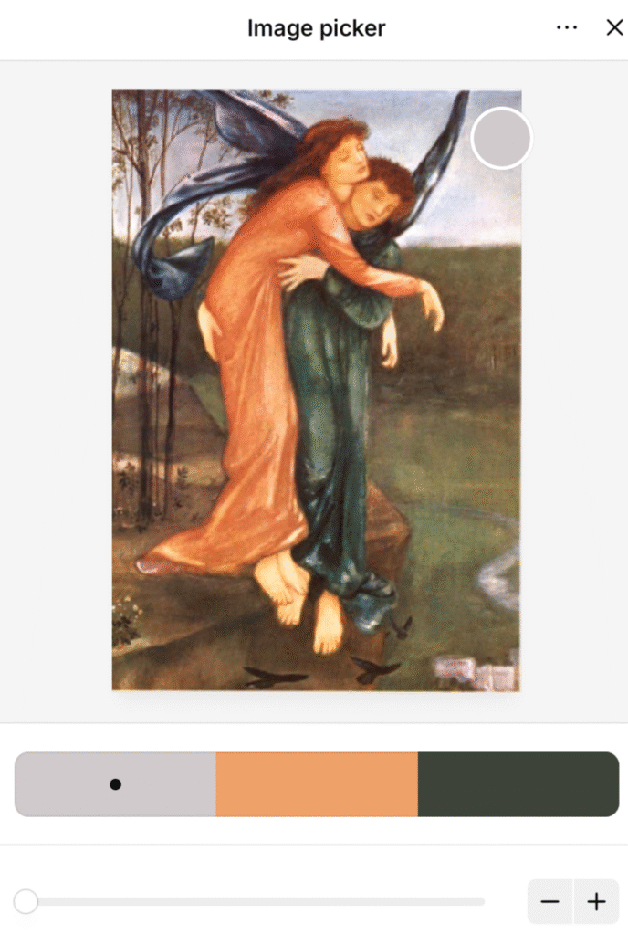
Use Digital Tools to Pull Exact Color Values
If you want the precise hex codes (perfect for design, branding, or digital art), try:
Upload the artwork and click on sections you love. Suddenly you have hex codes, CMYK values, RGB builds, the whole palette distilled from a brushstroke.
You can even create a swatch card labeled “Ophelia Greens” or “Rossetti Reds.”
Pay Attention to Neutrals
We often fixate on the brightest colors, but the neutrals are what make a palette powerful. Think:
- the ivory of skin tones
- the soft shadows under fabric folds
- the misty haze behind a figure
- the warm umber undertones in old oil paintings
These subtle hues keep the palette grounded and wearable, literally and aesthetically.
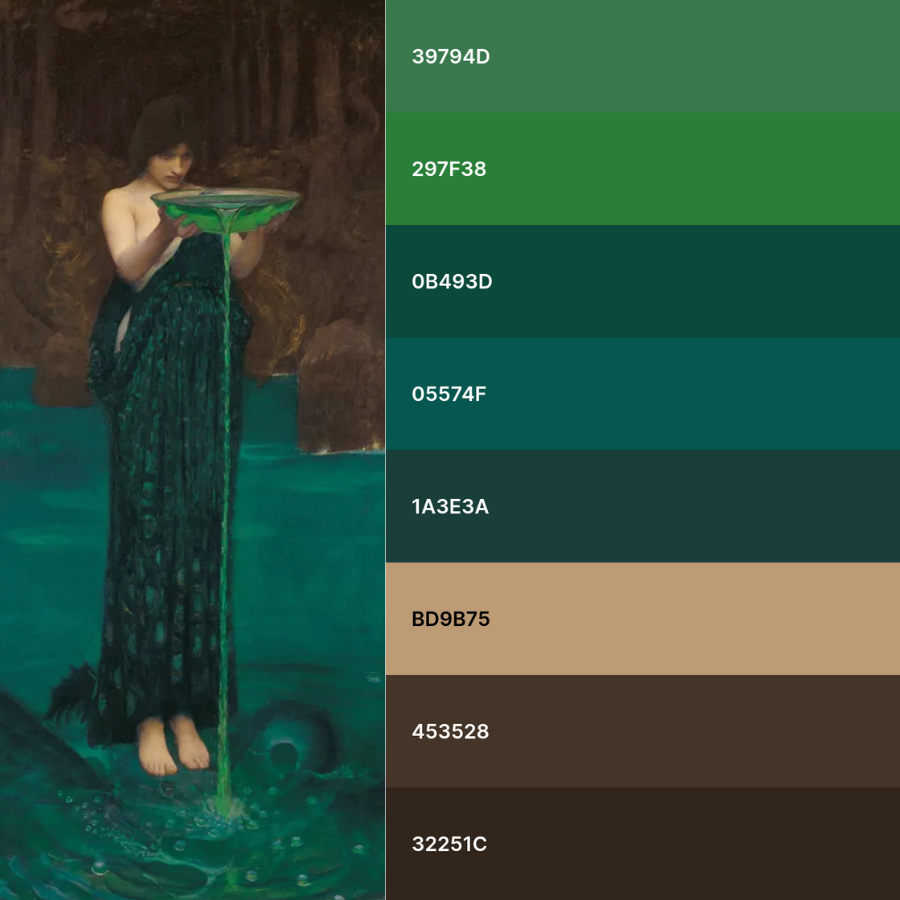
Here’s a palette I created using Circe Indvidiosa by John William Waterhouse. This is a stunning image filled with hypnotic greens and using a color picker tool, you can isolate specific hues and generate a HEX code for each one. You can then use the HEX codes when creating your own graphic designs.
Decide How You Want to Use the Palette
Once you’ve extracted your colors, translate them into real world uses:
For your home:
Use the base color on walls or linens, the accent color for pillows or artwork, and the shadow color for furniture or frames.
For fashion & personal style:
Your accent becomes a statement piece; your base becomes everyday wear; your shadow becomes the depth in accessories or outer layers.
For creative projects:
Apply the palette to your branding, illustrations, social media graphics, or journaling spreads.
For mood setting:
Let the colors shape your flowers, candles, playlists, even your makeup.
Color As An Act of Mindful Devotion
When you build a palette from artwork you love, you’re entering a conversation with the piece. It’s as if you’re saying:
I see you. I see what you’re made of. Let me carry a part of you into my own world.
Whether you’re designing, studying, journaling, or dreaming, color can be a bridge between past and present, between the Pre-Raphaelites and our modern creative lives..
Make It Your Own
Once you’ve gathered your palette, treat it like a box of magical crayons. Nudge the saturation, gently brighten the tones, let the colors dance a little. You’re not trying to recreate the painting, you’re borrowing its heartbeat and letting it hum through your own world.
Most of all, remember: color is meant to be played with! So go ahead! Experiment, delight, and enjoy every luminous minute of it.
For more beauty, color, and curiosity, subscribe to the Guggums newsletter
Leave a Reply